 Which Came First – The Impulse Or The Base?
There are two major components of a Supply or Demand zone – the Impulse Move and the Base.
Contrary to popular opinion, the Impulse Move is what defines the zone. Without an Impulse, there is no zone – just an area of consolidation!
What do I mean by that? Well, lets take a look…
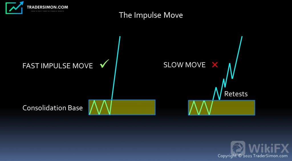
In the diagram below, we can see two representations of a move out of a base.
The (imaginary) market makes a fast, impulsive move out of the first base. The market doesnt look back – it shoots straight up, caused by an imbalance of buyers vs. sellers. This impulsive move confirms that the base IS indeed a Demand Zone.
The second illustration represents a market that moves slowly out of a base, making numerous “back and forth” retests. This is not a Demand Zone and will very likely fail if the market comes back to the base again.
In summary, its always the Impulse that defines the zone, and defining the base has secondary importance.
Once you understand this concept, youll find yourself looking for impulses on a chart first.
Forex Chart Example
Now lets look at a real example of some impulse moves on a 1 hour EURUSD chart.
I havent drawn the zones yet, because I want you to notice the fast impulse moves identified on the chart below. Notice how quickly the market moved up or down at the areas marked by arrows. The moves occurred in a short period of time, using a small number of candlebars and minimal (or zero) retraces:
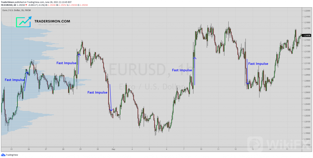
Once we have identified a fast impulse move, it becomes a lot easier to find the base of the zone.
Heres the Supply and Demand zones associated with those impulse moves. You can see the edge of the zone starts exactly where the market shot up or down.
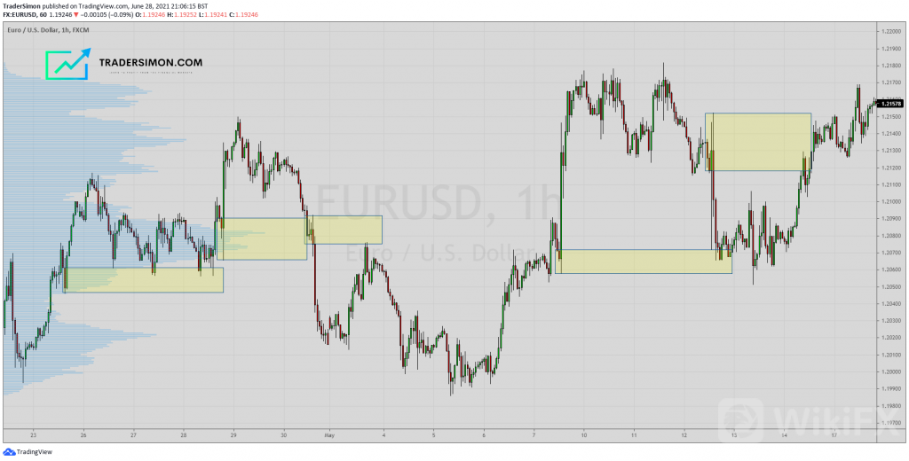
Note, that we‘ve kept it real here, by including zones that both worked and failed.To sway the odds of a successful zone further in your favor, you’ll need to learn about market structure, price action and filters that I teach in my courses as advanced topics. But let‘s attack this one step at a time… Rome wasn’t built in a day and for now, I want you to concentrate on learning the basic building blocks of my trading strategy.Drawing Supply Zones
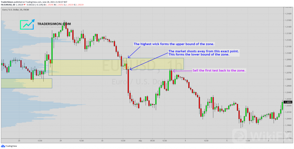
Were going to zoom in to one of those zones and see how the upper and lower bounds of the zone are drawn.
In the Supply Zone on the EURUSD chart below, the lower bound is the exact point the market dropped very quickly out of that small range.
The upper bound always uses the highest candle wick of the range.
Finally, when the market retraces to the zone, we can enter a short trade with a stoploss above the zone.
Drawing Demand Zones
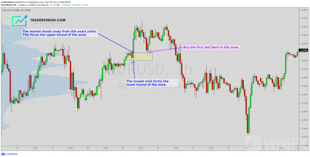
In the chart below, I‘ve marked a Demand Zone. This time, there are a few more candles to mark a distinct base. However, the method for drawing the zone doesn’t change.
The fast impulse move away, marks the top bound of the Demand Zone and the lowest candle wick marks the lower bound.
When the market returns to the zone, we can buy (go long) the market with a stoploss below the zone.
The Base
The small range that precedes the impulse move is known as the base. Ideally, it should be at least two candles, but not so many candles that it looks like a large consolidation range.
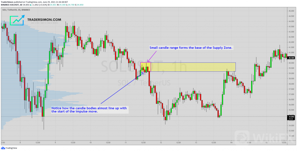
The Solana (SOLUSD) Cryptocurrency chart below shows a good Supply Zone base. There are 5 candles before the fast impulse drop.
Notice how the candle bodies line up almost exactly with that impulse move out of the base?
You wont always find the candle bodies lining up this uniformly, but when they do, it makes for a good zone with extra confluence.
Common Mistakes
Now lets look at some common mistakes I see from students of Supply & Demand.
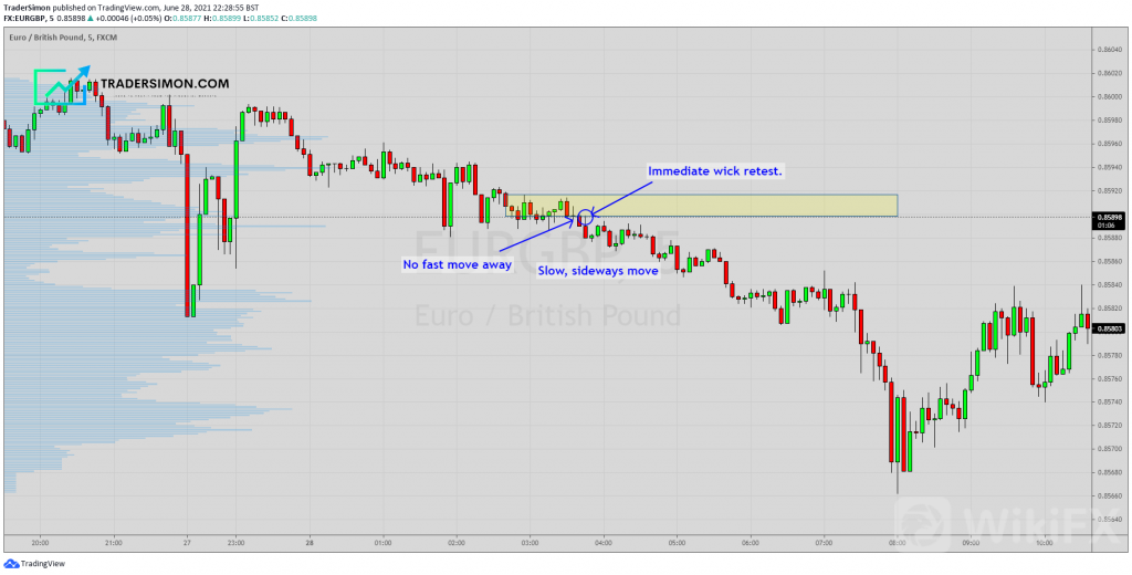
Remember, a zone must be identified by a FAST move away. Below is an example of a consolidation area (on a 5 minute EURGBP chart) that isnt a Supply Zone.
There was no fast move away from the area. In fact, the area was retested with an immediate “wick back” as soon as it started moving down. This slow stair-stepping action is exactly what you dont want to see for a good zone!
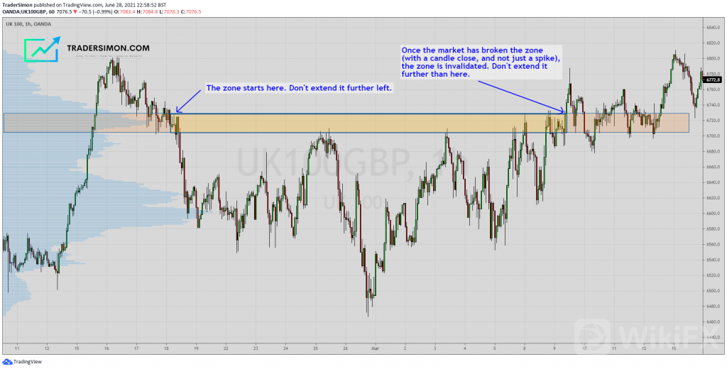
Cutting Through Candles
Finally, I see these mistakes a lot.
A zone should start at a small range of candles and end when the zone has been broken.
In this FTSE 100 hourly chart below, the Supply Zone has been drawn incorrectly and extends much too far to the left, past the original base of the zone.
Notice the multiple tests of Supply until the market finally broke through Supply and closed above. It is at that point, that the zone should end.
Conclusion
By now, you should now have a good understanding of how to draw Supply and Demand zones correctly.
If you enjoyed this article, please share it and pass it on via social media!


Leave a Reply